User experience (or UX) has become a discipline in its own right with the digitization of our lives. But it doesn’t just apply to online environments. The Italian highway A36 also named “Pedemontana” offers an example of a catastrophic user experience in the real world and in the digital world. Those who designed this highway seem to have wanted to bring together all the worst in terms of transparency, ease of use, ease of payment. The resulting catastrophic customer experience leads to maximum customer dissatisfaction that spills over to social media and to which the company in charge (Autostrada Pedemontana Lombardi) seems to give no importance.
La Pedemontana: understand everything about the worst UX in the world in 3
Pedemontana: a highway without barriers
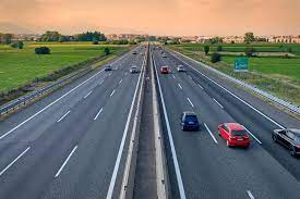
Usually a toll highway looks like this. At some point you stop (or slow down if you have a Tele pass) to pay. The barrier and the stopping of the vehicle to pay have been characteristic of the toll highway since its inception.
But not on the Pedemontana. This motorway, also called A36, located in Lombardy was opened in 2015. It was designed on a “free flow” type payment system, without barriers. It is therefore up to the user to carry out, after the fact, all the steps to pay. And that’s the rub. Because not only is the signage not very explicit (see below), but the payment system is also so complicated that one comes to think that it is made to trap users.
La Pedemontana, a highway hated by all users
To convince yourself that the Pedemontana is hated by its users, just go to Google. The opinions are final and the score (1.3 out of more than 1000 opinions) is the lowest I have seen so far. The answers left by the community managers of Autostrada Pedemontana Lombardi border on mockery. They could find their place in a manual of practices NOT to follow in the management of online interactions.
An analysis of the reviews left makes it possible to identify thehire ghost writers sources of customer satisfaction.
1/ Lack of transparency
The first recurring criticism is the lack of transparency of Pedemontana. The signage, although it meets the standards, is not very explicit. Most of the signs are in Italian and for the passing tourist it is very difficult to understand that payment is due. Complying with payment instructions is all the more difficult since at 130 km/h it is complicated to write down the instructions or, at the very least, the address of the site to consult.
In general, I think the main problem is the innovative principle of this highway. Who would think that a payment is due in the absence of barriers? A toll motorway is in fact associated, in the collective unconscious, with barriers and immediate payment.
2/ Pedemontana: incredibly complicated payment
The second criticism about the Pedemontana concerns the payment. If you were lucky enough to understand that you had to pay within 15 days, complying is far from an easy task. The payment procedure is incredibly complicated and completely opaque. Whether on the Pedemontana site, or on their app, you will first need to create an account and then complete the necessary forms to register your vehicle. The amount to be paid will be displayed on the basis of the license plate after 24 hours. You will not yet be at the end of your troubles since you will still have to pay. Remember to check your emails because you will not have any message in case of refusal of the transaction. That’s what happened with me. An email is however sent to you (in Italian only of course) which will tell you if the transaction has been refused, in which case you will have to start all over again.
In the end, paying the Pedemontana can easily take you 30 minutes. By transferring the cost of payment to usage, the Pedemontana is a highway that paradoxically wastes a lot of time rather than saving it thanks to its free-flow principle. This process is therefore the opposite of what a successful user experience should be.
3/ Prices are exorbitant from La Piedmont
The 3rd grievance against the Pedemontana is its exorbitant price. The Pedemontana not only costs 3 to 4 times more than a conventional motorway, but the price claimed is unverifiable. Neither the application nor the site gives you information on the prices charged and no information is provided to verify that the price claimed is correctly calculated.
4/ Recovery procedure
Finally, a recovery procedure is automatically triggered for all users who have not paid within 15 days. This also applies to foreign tourists who may not have understood what is written on the sibylline signs. Too bad for them. Do not imagine contesting. User complaints were dismissed in a recent order.
The main problem of the Pedemontana is the innovative principle of this highway. Who would think that a payment is due in the absence of barriers?
Why La Pedemontana has the worst UX in the world
The very definition of a good UX is to make life easier for the user in order to increase their satisfaction. In the case of the Pedemontana everything is done to achieve the opposite: maximum dissatisfaction. Here’sfiction ghostwriter:
- By removing the toll gates, the Pedemontana intends to save time for the user. By shifting the burden of payment onto the user afterwards, exactly the opposite happens.
- Users do not necessarily understand that they have to pay because the signage is not clear enough, especially at high speed.
- The payment procedure is sub optimally designed. Rather than starting the payment procedure by indicating the license plate, the designers force the user to create an account by filling in a series of information clearly not necessary for processing and disproportionate in terms of respect for privacy.
- The application and the site, in addition to the fact that they are badly or not translated, are riddled with bugs.
- No information on the calculation of the price to be paid is given, which reinforces the suspicions vis-à-vis Pedemontana